 The map of the London Underground. The stylized, snaking lines of the Washington Metro. They’re some of the world’s most familiar images: deceptively simple graphics that convey an enormous quantity of information in a small space.
From weather maps to interactive anatomies of the human body, infographics – visualisations that simplify complex information – have exploded in popularity as a method of communication in Western media and, increasingly, the developing world.
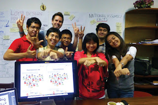
Now a team of young Cambodian designers, together with the BBC, have produced the country’s first advanced infographic: a flow-chart about voting ahead of next year’s elections.
At the end of November Mark Bryson, head designer for the web at the BBC, was flown from London to Phnom Penh to work with Loy9, the BBC’s Cambodia-based mass media campaign.
Over the course of two weeks he and a team of Cambodian designers produced an extensive flow-chart to educate young people about the stages of the democratic process – from icons representing social issues to little bobbing heads for representatives in the National Assembly.
A recent survey of 15-24 year-olds from all over the country conducted by Loy9 found that 30 per cent were unaware of the role of the Commune Council, while nearly 70 per cent said they did not know what the National Assembly does.
The Loy 9 campaign, which encompasses TV, radio, web and print, was intended to encourage the country’s young population to be involved with civil society ahead of local government elections in 2012 and National Assembly elections in 2013.
“There is a massive opportunity to use infographics to expain these things – a picture tells a thousand words. You don’t even have to read Khmer. If this is done correctly, without language you can still understand it,” Bryson said.
“Developing countries are really getting into infographics. It’s very new in Southeast Asia in general but it’s pioneering in Cambodia,” Bryson said.
One of the reasons was a gap between the visual understanding of Cambodians and visual symbols of the West, he said.
“We’re brought up with them from the age of zero, in a Western media context. We know how to read a flow chart, we know how to interpret an arrow as a shape or instruction or representation. That is not common in Cambodia.
“Cambodian visual metaphors are not like the Western visual metaphors,” he said, adding that some of the intial symbols created for use in the graphic were not understood by an audience of 30 young people from around the country.
“We had a big factory with a chimney that didn’t test very well with the audience. In the provinces it’s a smaller building with a flat roof and some windows,” Bryson said. The team settled on the latter image, with a riel note icon beside it.
But using infographics in Cambodia is a “prototype” that may not succeed when used in practice, admitted Colin Spurway, project manager of Loy9.
“It’s really a prototype, we want to see if it works and we’re ready for the chance that it might not. I don’t know of any cases where advanced infographics have been used before in Cambodia.
“It’s more of an oral culture: the written alphabet produces long words, there’s a tradition of painted signs. An infographic is a further step. We need to introduce it very slowly and simply, and it will need to be very carefully signposted or explained by a TV presenter,” he said.
No comments:
Post a Comment